CSS is Not Composable
I’ve been a .NET web developer for more than 12 years now. In that time, I’ve had quite a few projects at a mix of consulting gigs and various jobs. Generally, I am a full-stack developer meaning my work ranges all the way from the database, through the business logic and into the front-end html, CSS and JavaScript. The projects I work on are typically line of business web applications, though I spent a little bit of time at an interactive firm and my current job has me working on a public facing CMS and LMS. None of the projects I have worked on ended up with clean clear style sheets despite a variety of approaches to them. Inevitably, they started out not too bad and slowly devolved into a horrible mess.
My CSS Background
Before everyone tries to say that the teams and I just didn’t understand CSS or know how to use it. Let me say I am quite knowledgeable about CSS in regard to both technical and best practices respects. I understand the box model, selector specificity, floats and clearing, CSS 3 selectors and all the rest. I’ve read extensively online about CSS best practices on sites like CSS-Tricks, A List Apart, Smashing Magazine and many others. I’ve tried to understand OOCSS, SMACSS and BEM (which wins the award for ugliest naming convention). On different projects I have tried different approaches, including “anything goes”, semantic CSS and most recently trying my own flavour of OOCSS. I’ve recently gotten extensive experience with Bootstrap. I think it gives a good insight into how a lot of real world CSS is done. With all those approaches, the CSS becomes a mess and a pain. I’m open to the idea that I just haven’t found the “right” way, but I would argue that, after all that research and experience, the problem isn’t with me. It is either with the technology or the community’s inability to explain the right way to use it.
I used to be a true believer in semantic naming. In practice, that often means content based naming and lots of words from the business domain in the class names. However, that approach leads to many separate classes that have the same styling. Recently, I’ve been working really hard to try and create functional class names. That is quite difficult because there just aren’t enough page layout terms for all the classes and design elements that are needed. I found this approach eliminated the duplication of styling on many different classes, but there was a deeper problem. It was now very difficult to get things to layout correctly without littering the HTML with tons of classes, many with vague, easily forgettable names. In my reading, it seemed like this wasn’t supposed to be a problem. In fact, the goal was allow composable layout classes. I read that:
[…] a latest news module found in a sidebar should not be defined by its current place in the sidebar. It should be movable to a main content area, another module, the footer, so on and so forth.
Yet, I found the exact opposite was actually the case. When I used the OOCSS approach I ended up with design elements that only worked in one context and I either needed a different design element or lots of extra classes to express each of the different places it could appear. After more research, it seemed I’m not the only one who found this. Ben Frain expresses the same difficultly in his post “OOCSS/Atomic CSS are Responsive Web Design ‘anti-patterns’”. Now, to be clear I don’t think this is the fault of OOCSS. I think this is an inherent issue with CSS.
A Real World Problem
As an illustration, on my current project I was attempting to follow my new OOCSS like approach and found myself stuck. This was the issue that clarified for me what was wrong with CSS. The problem wasn’t that I couldn’t come up with any classes and CSS that would layout the page the way that was needed. It was that there was no way to make what I thought was a reusable CSS “object” that works when combined with various other design elements. It seemed to be necessary to have classes and styles for each specific context. In an attempt to learn what I was doing wrong, I posted the problem to Stack Overflow, asking what the “CSS Best Practices for decoupled modules” are? I worked hard to clearly express that the problem wasn’t that I couldn’t create classes and styles to meet my needs, but that I couldn’t do so in a composable way. I think I succeeded in expressing my question. In the next section, I’ll show a variant of the issue I used in my question. First though, let’s look at the answers I received.
There was only one response. I do appreciate the answerer taking the time to write up a lengthy response. It helped to further my understanding of the reality of CSS. However, the answer amounted to “that’s not how CSS works”. Additionally, he went on to describe a number of “best practices” that were just an explanation of how CSS works. It is a pet peeve of mine that the CSS community seems to be the only development community that thinks describing how the technology works is a description of best practices. In every other development community I have been involved with, best practices are those approaches and procedures an expert in the technology will find most effective. They assume the audience is already aware of how the technology works but that they need guidance on which of the many ways of using that technology would be most effective.
Modules that aren’t Modular
The example I used in my stack overflow question was an instance of what many designers call a “module”. A module is any design element that has a standard box appearance, but can contain a variety of contents. A common example of a module is the aside. Typically asides are presented as floating boxes of a fixed width with certain margin and padding. Most commonly asides contain paragraphs of text. However, some asides might also contain lists, quotes, floating images or even a little form (for example, an aside might provide a contact form).
The problem arises with the bottom padding of the module. The designer wants to ensure that there is always at least so much padding. However, some elements have their own bottom margin. That margin combined with the padding causes too much white space at the bottom of the module. We can’t simply adjust the padding so the total white space is correct because the module can contain different elements with different bottom margin. This is a common enough problem that CSS-Tricks describes 7 ways to solve the problem in their article “Spacing The Bottom of Modules”. The last solution they land on is to remove the margin from the last element in the module and its last children like so:
.module > *:last-child,
.module > *:last-child > *:last-child,
.module > *:last-child > *:last-child > *:last-child
{
margin: 0;
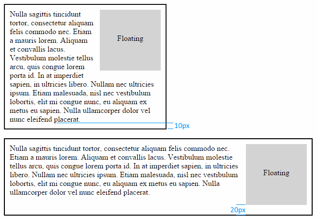
}However, that isn’t really composable either. The problem is that the last child is the last child in the DOM, but may not be the last child visually. This can happen when there are hidden or floating elements. The visually last element can even be dynamic. Consider a module containing a floating element in a fluid responsive layout. The floating element needs left and bottom margin to provide space between it and the wrapping text. When the viewport is narrow, the text may be the element in contact with the bottom of the module. However, as the viewport gets wider, the floating element may become the element in contact with the bottom of the module. Then the space between them will be the sum of the module padding and the floating elements margin. That is more space than desired. One could use a media query to remove the bottom margin of the floating element at this point. However, because the width this occurs at is dependent on the exact size and position of the floating element as well as the exact text and font, this would have to be done on a case by case basis.
This is just one example of situations like this. There are many other ways this happens. As another example, imagine a responsive grid layout. It could be the case that at each breakpoint a different element becomes the visually last element in a container and each one has different margin. Correcting that requires a very complex set of breakpoints in one’s style sheet. There is no general, composable, way to deal with these issues. The only approach I can find is to deal with them on a case by case basis on each page or particular arrangement of elements.
What’s My Container Width?
Lest you imagine this problem is limited to margin and padding, consider the humble article image on a fluid site. Imagine in our design that at larger viewport sizes the image should float to the right with text flowing around it with a certain amount of margin all the way around. Of course, at some point as the view size gets smaller, we will want to stop floating the image and change to a centered block. That should be simple enough. We can use a media query to change the layout at a certain breakpoint. If we know the width of the article area and the width of the image we can easily decide on a reasonable breakpoint that prevents the text area to the left of the image from being too thin.
However, what if those two implicit assumptions don’t hold? Imagine that, on our main page, articles are displayed 100% width, less some margin on the sides. On category pages, articles are displayed at 80% width to allow for a 20% navigation bar. Now the width of the article is context depended. We can imagine more complex site designs with more than two different article width contexts. Alternatively, imagine that the images in different articles aren’t all the same width. We’ll set a max width and height so they never get too big, but depending on the image size and aspect ratio we could need a different breakpoint for every image. What is really needed is the ability to change the style based on the size of the container or better yet, based on the amount of space between the element and the edge of its container. That is how a designer would express the rule. He would say, when the space for the text next to the image is less than a certain amount, rather than floating the image center it above or below the text.
CSS is Not Composable
I believe the root of the problem with CSS is lack of composability. There are minor annoyances like, the lack of variables which can be addressed by preprocessors such as Less and Sass. Yet the challenge of CSS remains. If CSS was composable, it would mean design elements could be placed next to one another or nested or combined on the same element without unexpected consequences. Without requiring special CSS for the particular combination of design elements or particular page. The need for CSS for each particular combination produces coupling. Design elements are no longer fully independent. This coupling, just as in object oriented design, leads to difficult to understand and maintain code that lacks flexibility. Composability produces flexibility because it enables rearrangement in a myriad of ways. I long for a web design language with that power and elegance.